Card Collection
You can collect card information in a few ways with Evervault, but our prebuilt UI components are the most common. Cardholder data that's encrypted with Evervault can be safely stored in your database and then shared with third-party payment processors using Relay. This guide walks you through the entire process using our Card component for collection.
Enter a test card to try the demo
1{
2  card: {
3    number: "",
4    cvc: "",
5    expiry: {
6      month: "",
7      year: ""
8    }
9  }
10}
The Card component
The Card component is a secure iframe, hosted by Evervault, that you embed in your product to collect card data. When customers input their card information, it's encrypted within the iframe before being returned to you for storage. This approach reduces your PCI DSS scope because Evervault hosts the iframe, and you never handle plaintext card data.
Get started with the Card component
Install the Evervault SDK
Our JavaScript SDK is distributed from our CDN, and can be installed by placing this script tag in the head of your HTML file. The SDK must be loaded directly from our CDN and can't be bundled with your application or self hosted.
Once the SDK is installed, initialize it using your Team ID and App ID. You can find these in the Evervault Dashboard.
You can also install Evervault via the @evervault/js package on npm. This package is a light wrapper which handles loading the SDK from our CDN and also provides TypeScript definitions.
Frequently Asked Questions
Create a Card component
Initialize the Card component and mount it to a DOM element. See the SDK documentation for available parameters.
You can customize the appearance of the Card component by passing a custom theme or extending one of our prebuilt themes. Read more about customization.
Submit the encrypted card data to your API
The encrypted card values can be accessed from the card.values object or by subscribing to the change event with the card.on method.
Inside your submit handler, you can access the encrypted card data and pass it to your backend.
Forwarding encrypted card data
Now that you have the encrypted card data, you need to pass it to a third-party payment processor (Stripe, Adyen, etc.). To do this, you use Relay to decrypt the data after it leaves your infrastructure, and before it reaches the third-party API.
Relay is a network proxy that can be configured to decrypt data during a request. When you proxy a request through Relay, the encrypted cardholder data is decrypted, allowing the request to be processed as normal when it reaches the third-party. This means the encrypted card data you collect reaches the PSP as plaintext data, without you ever handling the raw form.
Create a Relay
To simplify this example, we'll use PutsReq to simulate a third-party API. PutsReq provides a temporary endpoint that we can send requests to, however, in practice, this would be an endpoint from a third-party service.
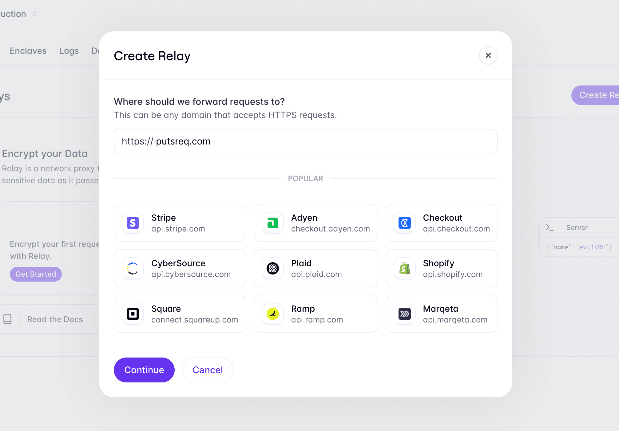
To create a Relay for your PutsReq endpoint, navigate to the Relays tab in the Evervault Dashboard, click Create Relay, and add the PutsReq endpoint to the destination field.
Configure the Relay
By default, Relays are just transparent proxies that don't decrypt any data. They can be configured to perform encrypt and decrypt operations on request or response. For this example, the Relay needs to decrypt encrypted card data on request as it's proxied to the third-party endpoint.
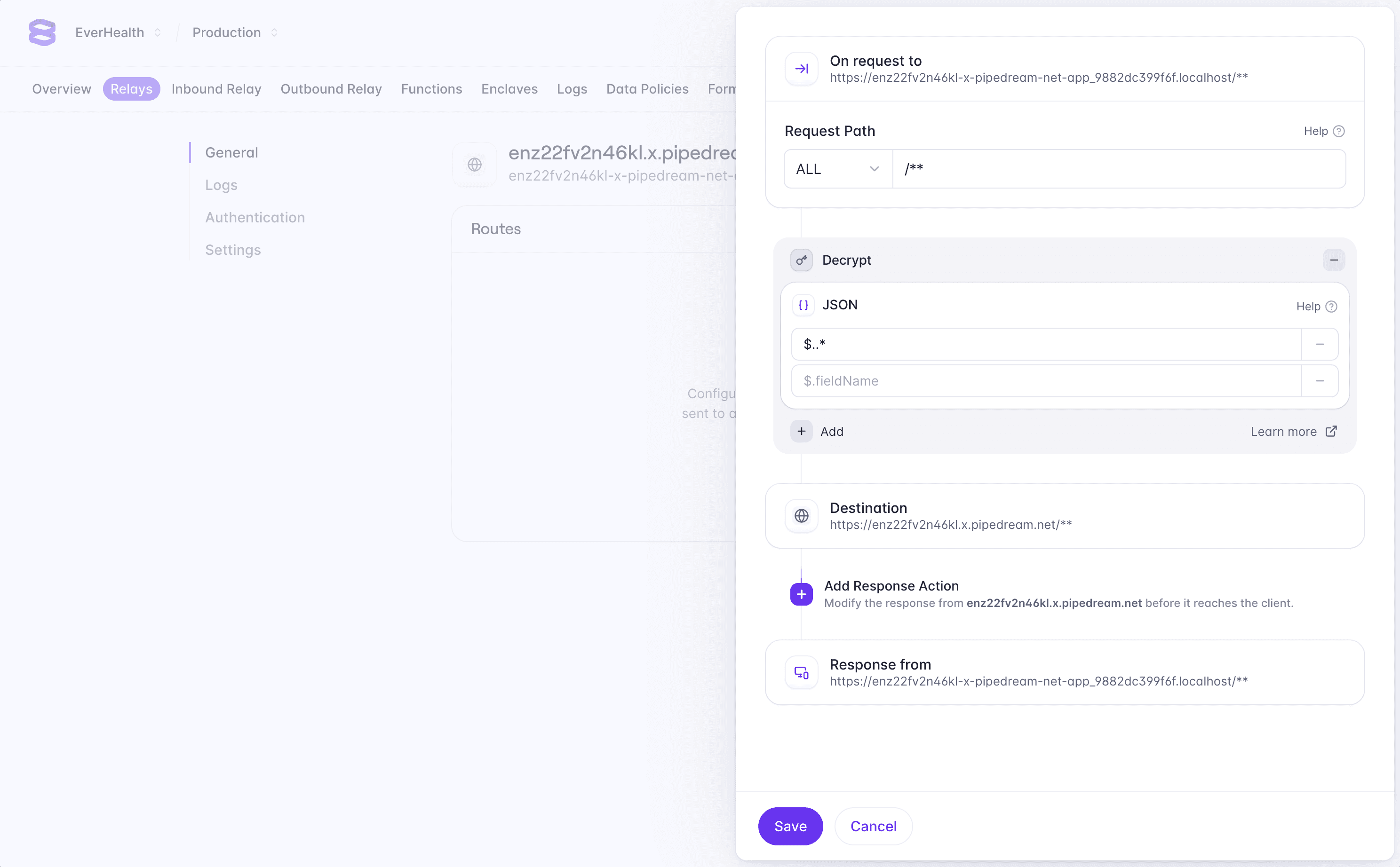
In the Dashboard, click the Add Route button to configure a new route. We want to decrypt any data being sent to this endpoint, so we can enter /** in the path field to match all requests sent to the Relay.
Next, we can add a request action to decrypt any encrypted data in the request body. Select Add Request Action -> Decrypt -> JSON, and enter $..* in the fields to decrypt. This configures the Relay to match any encrypted JSON fields in the request body and decrypts them.
You can learn more about field selection in the Relay documentation.
Integrate the Relay
Finally, we can implement our API endpoint to pass encrypted card data to the third-party payment processor using the Relay you just created. When requests are sent, card data is automatically detected and decrypted before it reaches the third-party API.
Relay authentication
Notice we're sending the X-Evervault-App-Id and X-Evervault-Api-Key
headers to the Relay. These headers are used to authenticate the request to
the Relay. We recommend enabling Relay
authentication when sending requests to third-party
APIs.
Loading performance
The Card component is an iframe served from a separate origin, so it needs time to connect, download, and start up before customers can type into it. Each component is lazy loaded as its own module, so the iframe only downloads the code for the component you render. If the card form is only shown later, such as in a step-based checkout or a drawer, preload loads it in the background (so it's hidden at first). It's then displayed immediately when you show it.
If the Card component is visible when your page loads, mounting it's enough and preload won't help. Otherwise, call preload early, then show the card at the payment step with show.
Use preload and show in place of mount. If you also call mount on a preloaded Card component it throws an error. See the SDK reference for details.
Customization
The Card component can be fully customized to match the design of your application. By default, the Card component has no styling applied. You can use one of our prebuilt themes or build your own.
Customization works in layers. Start with a prebuilt theme and go deeper only when you need more control.
Use a prebuilt theme
The SDK has three themes to get you started: clean, minimal, and material.
Quick restyle
For a quick restyle, the clean, minimal and material themes accept a few config options, so you don't need to write any CSS. Pass them as the only argument.
Config options
The accent color. Used for the border of a focused input, and for the label of a focused field in
material. Defaults to#6633ee.The color of placeholder text, and of labels in
material. Defaults to#717f96.The corner radius of inputs, such as
"12px". Inminimal, it applies to the outer corners of grouped fields. Defaults to6px.The font family for the whole component, such as
"Inter, sans-serif". Load the font withfontsand include a fallback. Defaults to the iframe's font.
Use your own CSS variables
The Card component renders inside an iframe, so it can't read the CSS variables on your page. The cssVar helper reads a variable from your page's :root and returns its value, so the component can follow your own design tokens.
The value is read once, when you create the theme. If the variable isn't set, or there's no window, such as during server rendering, cssVar returns an empty string and the theme's default is used.
Customize prebuilt themes
To customize a prebuilt theme further, pass your own theme as the first argument. A theme is an object with a styles property, written in CSS-as-JS. Your styles are merged on top of the prebuilt ones, so you only write what you want to change.
To use your own styles together with the config options, pass your theme first and the config second.
Total theme override
When you want to replace the prebuilt rules instead of extending them, override an element with selectors, or use your own theme.
Override an element with selectors
Use selectors in the config to override how a prebuilt theme styles a specific element. It takes the same CSS-as-JS format as styles. A :root entry is merged into the theme's variables. Any other selector replaces the theme's rules for that selector, so repeat the properties you want to keep. Your own styles have priority, and are used if both set the same property.
This example restyles the labels and leaves the rest of the theme alone.
Pass your own theme
Pass your own theme as the theme option. A theme is an object with a styles property. The styles property uses a CSS-as-JS format to define CSS rules for the component. These rules are compiled to CSS and injected into the iframe.
Edit the JSON below to update the card theme live
{
  "styles": {
    ":root": {
      "color-scheme": "light"
    },
    "label": {
      "fontSize": 11,
      "fontWeight": 500,
      "textTransform": "uppercase"
    },
    ".error": {
      "color": "red",
      "fontSize": 12,
      "marginTop": 5
    },
    ".field input": {
      "marginTop": 5,
      "padding": "8px 12px",
      "border": "2px solid #dddddd"
    },
    ".field:focus-within input": {
      "borderColor": "#6633ee"
    }
  }
}
Element attributes
Although you can customize the CSS inside of the iframe, you can't modify the HTML. We know that layout can have a big impact on style definitions and so to help with this, we apply custom attributes to various elements within the iframe. These attributes are prefixed with ev-.
You can see our premade UI component themes for an example of how these attributes can be used when creating themes.
fieldset attributes
The following attributes are added to the `<fieldset />` tag that wraps the entire component.
The name of the component.
Whether or not all of the fields within the component are valid.
.field Attributes
Each field in the component is wrapped in a <div /> with a '.field' class and the following attributes.
The name for the individual field within the component.
Whether or not the field is valid.
Whether or not the input has a value.
Custom fonts
You can load additional fonts from Google Fonts by providing a fonts array in the theme definition. To use fonts that aren't on Google Fonts, embed them as base64 data URLs using the fontFaces array.
Responsive styling
You can define media queries inside of the themes styles object, however, this may lead to unexpected behaviour as the media queries are matched against the iframe document, not the parent document. To get around this, we provide a media utility which allows you to define styles based on media queries that match the parent document.
To access the media utility, you need to define your theme as a function that returns a theme object. This function is passed a utilities object as an argument, which contains the media utility. The media utility should be spread into the styles object of the returned theme.
Custom card brands
By default, the card component recognizes a fixed set of card networks but you can extend it with your own brands using evervault.brands.create. This creates a brand which you can then pass into the card component with the customBrands option.
The ranges argument accepts a BIN prefix (e.g., 9900) or an inclusive range of prefixes (e.g., [88000, 88999]). The card component always accepts custom brands, even if acceptedBrands is set to restrict standard networks.
Agent tools
The Card component can register WebMCP tools inside its iframe. This lets browser agents fill in the card form through a structured interface instead of guessing at the DOM.
Experimental
WebMCP is an experimental browser API. It requires Chrome 149 or later with the #devtools-webmcp-support and #enable-webmcp-testing flags enabled in chrome://flags. Agent tools require @evervault/browser 2.67.0 or later, or @evervault/react 2.30.0 or later.
Enable agent tools
Agent tools are off by default. Pass the agentTools option to enable it.
agentTools options
Registers the tools when set to
true. Defaults tofalse.The prefix for every tool name. For example,
acmepayproducesacmepay-focus-field. The value is converted to a lowercase slug, and defaults to your App ID. Set a distinct prefix for each card if you mount more than one on a page.The name used in tool descriptions and error messages that agents read. Defaults to
the secure card form.The origins allowed to discover and call the tools. Defaults to current page's origin. Only secure origins are kept:
https://origins, orhttp://localhostandhttp://127.0.0.1. Origins with a path, query, or fragment are dropped.
You can set namePrefix and productName to your own brand so agents see tools named after your product rather than Evervault.
Available tools
The Card component registers three tools. Each one maps to something customers can already do in the form, and none of them return card data.
Tools
Returns the status of each field in the form, including whether it has a value, whether it's valid, and any error code and message. It also returns
isCompleteand the currently focused field. This tool is read-only.Moves keyboard focus to a field so the customer can type into it. Accepts a
fieldargument, which must be one of the fields shown in the component.Enters a value into a field as if the customer had typed it, validates it immediately, and returns the updated form status. Accepts
fieldandvaluearguments. Card number and CVC are digits, and the expiry uses theMM/YYformat.
Values entered by agents go through the same encryption and validation as values typed by customers. They're emitted through the normal change and complete events, so your existing checkout logic handles agent-filled forms without changes.
Submission stays with your page. After <prefix>-get-form-status reports isComplete, agents can call your own checkout action.
Security
Agent tools are designed so that plaintext card data never leaves the iframe.
- Tool results only include field status, never card values.
- Card data leaves the iframe encrypted, through the existing component events.
- The iframe's Permissions Policy only allows WebMCP when
agentToolsis enabled. - Only origins listed in
exposeTocan discover and call the tools.
The Card component iframe is served from https://ui-components.evervault.com. Your page can discover the tools by passing that origin to document.modelContext.getTools.
Consequential actions
WebMCP tools can set consequentialHint: true in their annotations to mark a significant, real-world action. Chrome's WebMCP guidance recommends using this so that agents request confirmation from customers before taking an action.
Evervault's Card component doesn't set consequentialHint on its tools. This is because the agent can only enter card details the customer has already provided, and completing purchases is controlled by your page. Evervault does recommends setting consequentialHint: true on your own tools that act after card collection, such as submitting a payment, placing an order, or completing checkout. How agents handle the hint isn't standardized yet.
What's next
- Network Tokens
Learn how to use Network Tokens to protect your customers' cards and improve authorization rates.
Other collection methods
For card collection, we generally recommend using our UI components, but if those don't work for your use case, you can also collect card information server to server and with our SDKs (each SDK has an encrypt method). These options can impact your compliance scope depending on what you implement. If the flow you build exposes you to plaintext card data, it can increase your PCI DSS scope.
For server to server, create a Relay that encrypts data for inbound requests to your server. The external server making the call needs to send the request to your Relay, which encrypts the sensitive data and then forwards the request to your server. For client side encryption with the SDK, use the encrypt method.