Products
UI Components
We recently deprecated our Inputs product in favour of UI Components. To help you transition, we've created a detailed migration guide.
UI Components make it easy to collect or display sensitive card data securely in the browser. UI Components are served within an iframe retrieved directly from Evervault's PCI-compliant infrastructure, and all operations occur within Evervault's PCI Compliant environment.
Adopting this approach for collecting or displaying card data can reduce your PCI DSS compliance scope to the simplest form (SAQ A Control Set), once integrated correctly.
UI Components are fully customizable and can be updated to match your design system.
Installation
To use UI Components, you will first need to install either the Javascript SDK or React SDK.
Add our React SDK as a dependency.
Once installed, initialize the React SDK by wrapping your app with the EvervaultProvider component. You can find your Team and App ID's in the Evervault Dashboard.
Card
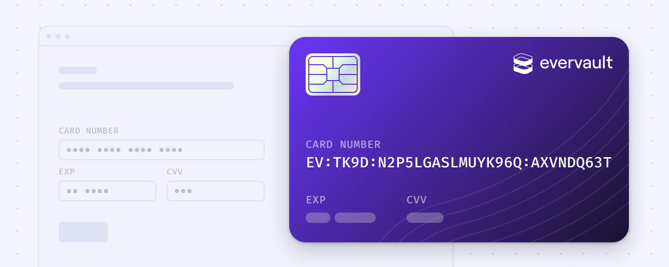
The Card component allows you to securely collect and encrypt card data while minimizing your PCI compliance scope. The encrypted card details can be safely passed to your backend and stored in a database without ever handling card data in plaintext — reducing your PCI DSS compliance scope to the simplest form.
Pin
The Pin component allows you to securely collect and encrypt pin numbers in a completely PCI-compliant environment.
Reveal
The Reveal component allows you to display previously encrypted card data in a secure and compliant environment — reducing your PCI DSS compliance scope.
Setup
To use Reveal, you'll need to have a JSON endpoint to fetch the data from. This endpoint is then proxied through Relay to decrypt encrypted data sent from this endpoint. Reveal will only accept requests made to Evervault Relay domains so you must proxy your request through a Relay.
It's also important that the endpoint that you create sets applicable CORS headers so that it can be accessed from the Reveal Component iframe. Otherwise your requests will fail.
Once you have an endpoint which retrieves the encrypted data, you can use the Reveal Text consumer component to select which field from the response payload to display. You can also use the Reveal Copy Button component to render a button to copy the value to the users clipboard.
Styling
UI Components can be customized to match your brand's design system. Themes allow you to completely customize the CSS styling inside of a UI Component iframe. You can pass a theme to any UI Component using the theme option.
Built-in themes
To help you get started, the SDK's have three built in themes you can choose from; clean, minimal and material.
Custom Themes
A theme is just an object with a styles key. This styles key uses a CSS-as-JS format to define CSS rules for the component. These rules will be compiled to CSS and injected into the iframe.
You can create a completely custom theme or pass a theme to any of the built in themes to further customize it to match your branding.
Element Attributes
Although you can customize the CSS inside of the iframe, you cannot modify the HTML. We know that layout can have a big impact on style definitions and so to help with this, we apply custom data attributes to various elements within the iframe. These attributes are prefixed with ev-.
fieldset Attributes
The name of the component. Useful for scoping selectors to certain types of UI Components.
.field Attributes
You can see our premade UI Component themes for an example of how these attributes can be used when creating themes.
Custom Fonts
You can load additional fonts from Google Fonts by providing a fonts array in the theme definition.
Currently we only support custom fonts via Google Fonts.
Responsive Styles
You can define media queries inside of the themes styles object, however, this may lead to unexpected behaviour as the media queries will be matched against the iframe document, not the parent document. To get around this, we provide a media utility which allows you to define styles based on media queries that match the parent document.
To access the media utility you will need to define your theme as a function that returns a theme object. This function will be passed a utilities object as an argument, which contains the media utility. The media utility should be spread into the styles object of the returned theme.
Supported Cards
| Name | Value |
|---|---|
| American Express | american-express |
| Visa | visa |
| Mastercard | mastercard |
| Discover | discover |
| JCB | jcb |
| Diners Club | diners-club |
| UnionPay | unionpay |
| Maestro | maestro |
| Mir | mir |
| Elo | elo |
| Hipercard | hipercard |
| Hiper | hiper |
| Szep | szep |
| UATP | uatp |
Security
Evervault UI Components are served through an iframe hosted on Evervault's compliant (PCI DSS Level 1) infrastructure.
Evervault is responsible for the security of the servers providing the iframe, meaning your cardholder data environment is reduced to the smallest size possible.
All credit card data is encrypted client-side using the Web Crypto API, so no cardholder data leaves your user's device without being encrypted using Evervault Encryption.